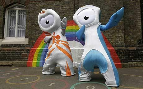
當地時間5月19日晚,倫敦奧組委公布了2012年倫敦奧運會和殘奧會的吉祥物,奧運會的吉祥物的名字為文洛克,而殘奧會的吉祥物名為曼德維爾。兩個吉祥物均為只有一只眼睛的金屬機器人,主色調為金屬色,極具運動性。這兩個獨眼卡通形象的吉祥物一經推出,除了賺足人們的眼球之外,也引來了不少英國人的口誅筆伐。英國品牌設計專家稱這兩只怪異的吉祥物是“費力不討好的垃圾作品”,簡直就是一場“災難”,并抨擊倫敦奧組委花費巨資創造出如此令人費解的設計。對此,倫敦奧組委執行委員會主席勞德則反駁稱,這兩只吉祥物將可以激勵更多的年輕人加入奧林匹克運動中。批評人士卻表示,吉祥物的設計要遵循的基本準則應該是要人們喜聞樂見,而不是怪異。2007年,倫敦2012年奧運會會徽發布時也曾遭到惡評。

 |
|
Bolt from the blue: the Olympic mascot Wenlock, left, and the Paralympic mascot Mandeville strike an Usain Bolt pose. (Agencies) |
The organizers of London 2012 were plunged into a fresh row after the new Olympic mascots were branded “patronizing rubbish” by design experts.
The two metallic characters, named Wenlock and Mandeville, were unveiled on Wednesday night after a rigorous 18-month design process involving 40 focus groups.
Apparently hewn from the “last drops of steel” left over from constructing the final support girder of the Olympic Stadium, the one-eyed creatures are intended to help young people relate to the Games.
But branding experts last night called them “a calamity” and accused Olympic bosses of wasting thousands of pounds on their creation.
Stephen Bayley, the prominent design critic, said: “What is it about these Games which seems to drive the organizers into the embrace of this kind of patronizing, cretinous infantilism? Why can’t we have something that makes us sing with pride, instead of these appalling computerized Smurfs for the iPhone generation?
“If the Games are going to be remembered by their art then we can declare them a calamitous failure already.”
Lord Coe, chairman of the London Organizing Committee of the Olympic Games, defended the mascots, saying they would inspire young people to engage with sport.
“We’ve created our mascots for children. By linking young people to the values of sport, Wenlock and Mandeville will help inspire kids to strive to be the best they can be,” he said.
But critics said the design would leave young people baffled. Aaron Shields, a partner at the design agency BrandInstict, said: “I don’t think people are going to relate to these very modern creations. The first rule of mascot creation is to make something familiar and accessible, not something alien. This is just going to be seen as another disappointment coming out of the Olympic Games.”
The two characters are named after the village of Much Wenlock in Shropshire – which hosted a precursor to the modern Olympic Games in the 19th Century – and Stoke Mandeville hospital in Buckinghamshire, the birthplace of the Paralympic Games,
In homage to London's taxis, each has a yellow light on top of its head, with an initial in the middle.
Organizers would not comment on the cost of creating the mascots, which were designed by the London-based creative agency Iris, but claimed it had been kept to “a few thousand pounds” because large parts of the work were done in house or with the help of sponsors.
The controversy follows a similar row over the 2012 logo, which was unveiled in 2007 after organizers spent £400,000 on its design.
Mr Stephen Bayley condemned the logo at the time as "a puerile mess, an artistic flop and a commercial scandal".
相關閱讀
(Agencies)

(中國日報網英語點津 Helen 編輯)
